This may seem a bit premature since it deals with the 2022 Calendar. It is rapidly nearing completion, so it will be one less project out of the way, so I can get out and explore places with summer approaching.
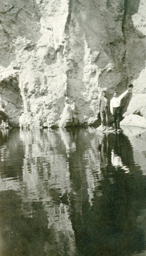
This particular photograph is giving me some trouble, so I am seeking opinions. It was taken in 1922, and quite unique. When I enlarge it to size needed for calendar, it looses some clarity, if you look at it up close. However, when one looks at it from a distance, like one would with a wall calendar, it looks just fine.
Any thoughts?
Tim
Most wall calendars are looked at from a distance. I like it and think it should be included.
I think it is intriguing because the gentlemen do not look like they are wet. How did they get on that small rock without getting soaked?
Tim:
If you don’t have Photoshop or something similar (I use Adobe Lightroom), send me the biggest electronic copy you have. I can make some adjustments that improve the apparent sharpness.
I am not at all bothered by a little grain! I vote that you include it – it is a wonderful shot!
I don’t know if it helps now, but increasing you pixels-per-inch (ppi) when you manipulate the image size helps a considerable deal when auto-sharpening.